
🎨 5 Mistakes Queens Village Homeowners Make When Choosing Paint Colors
Choosing paint shouldn’t be stressful—but one wrong shade can change everything. Avoid these common mistakes and get it right the first time.
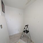
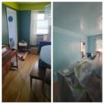
Paint colors look different in every Queens Village home. Lighting, space, and finishes all play a role. Here are the most common mistakes we see—and how to avoid them.
That perfect shade you picked under bright store lights?
It can look totally different in your home.
Queens homes often have:
Limited natural light
Warm indoor lighting
Shadows from nearby buildings
👉 Fix: Always test samples on your actual walls and check them throughout the day.
Not all whites… are white.
Some lean:
Yellow (warm and creamy)
Blue (cool and crisp)
Gray (modern but can feel cold)
Even pink (yes, really)
👉 Fix: Compare colors side-by-side. Undertones show up fast when placed next to each other.
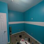
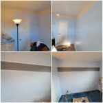
We get it—dark colors look bold and modern.
But in smaller Queens Village rooms, they can feel tight and heavy if not done right.
👉 Fix:
Use darker tones as accent walls
Balance with lighter trims or ceilings
Make sure there’s enough lighting to support it
Your walls don’t live alone.
Paint needs to work with:
Floors
Cabinets
Furniture
Countertops
👉 Fix: Bring samples close to these elements before committing. What works on a blank wall may clash in a finished room.
This is the biggest mistake of all.
A color chip is small… your wall is not.
👉 Fix:
Test at least 2–3 options on different walls. Live with them for a day or two before deciding.

Not Sure Which Color Works in Your Space?
We help Queens Village homeowners choose colors that look right in their lighting and layout.
👉 “Serving Queens Village, NY and surrounding neighborhoods”